Hilo, HI
Ka Paʻakai Consulting
Ka Paʻakai Consulting works alongside kaiāulu to mālama for that which feeds them. We bring together deep community grounding and institutional experience to kākoʻo resource stewardship, evaluate the work being done, and apply indigenous pathways meaningfully in contemporary spaces so communities can thrive on their own terms
Sector
ʻĀina Stewardship
Consulted
2026
Ka Paʻakai Consulting carried real depth of work, but little of it was visible. Two problems stood in the way: no defined visual identity to set the brand apart from the handful of other organizations built around the word "paʻakai," and no consistent way of carrying its moʻolelo across the places clients actually encountered it. Left as-is, that gap risked reading the brand as informal or underdeveloped — at odds with the caliber of expertise behind the name. And because Ka Paʻakai Consulting operates as a focused, values-driven practice rather than a large firm, some organizations look elsewhere for greater availability or capacity on big, fast-moving projects.

The shift started with a reframe: Ka Paʻakai Consulting was not built to compete for attention or growth. Its existing audience already trusts its value and finds the brand through relationship rather than visibility. That trust runs deeper for Native Hawaiian clients in particular: being served by one of their own, rigorously accredited and fluent in both indigenous ways of knowing and professional practice, is rare, and it matters to the people the brand serves. Ka Paʻakai Consulting didn't need to get louder to be seen. It needed an identity confident enough to hold the quiet.
Ulumano's solution was to build Ka Paʻakai Consulting's first true visual identity out of its own name and origin, rather than the generic cultural imagery or activist-style branding common in the space. Despite the name, no comparable organization had translated "paʻakai" itself into a visual system. That gap became the opening: a custom wordmark and identity language rooted in salt, its gathering, and the principle of taking only what is needed and leaving enough behind.

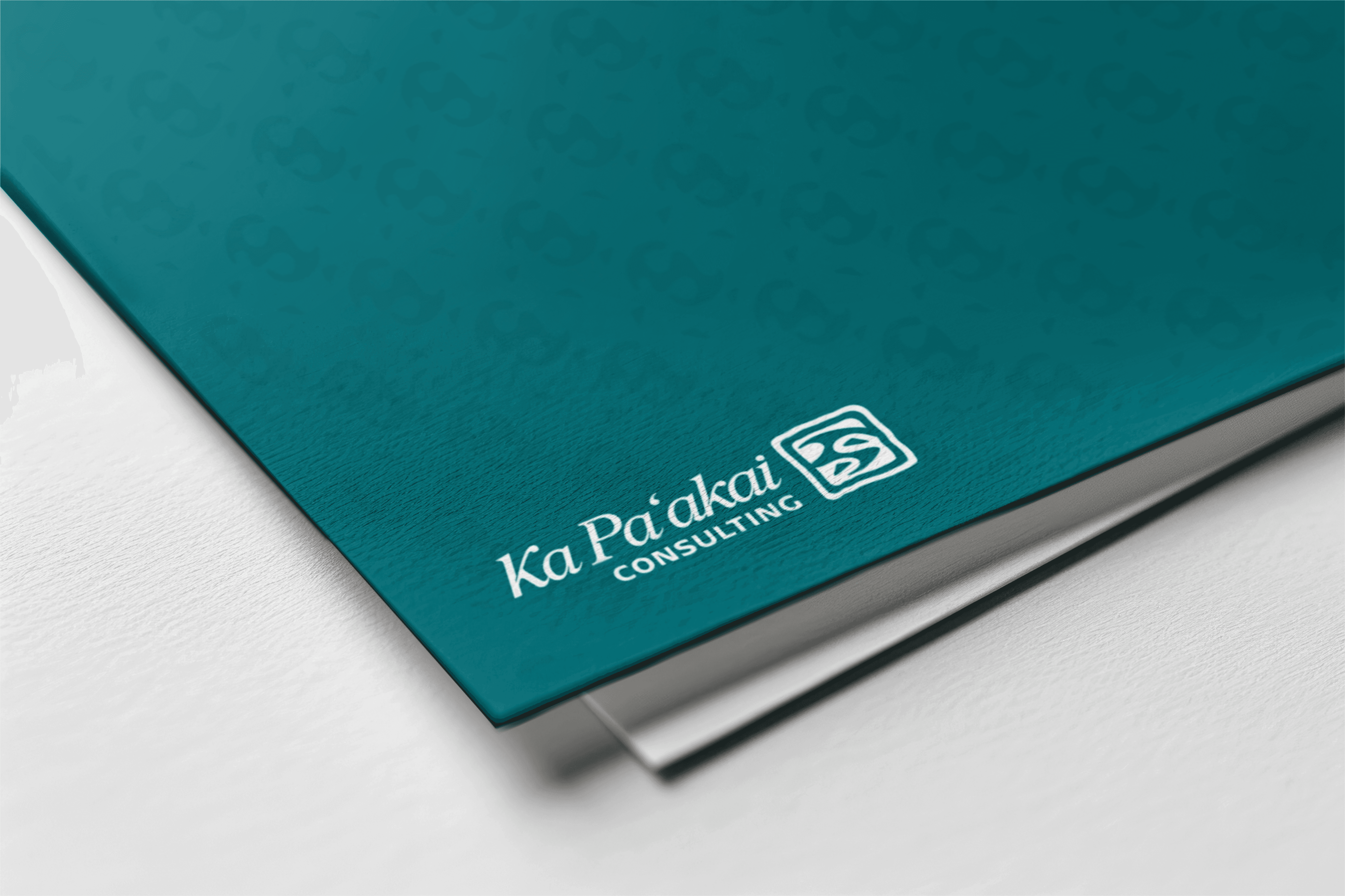
The creative direction is modern, organic abstraction. A quiet, confident tone that reads as composed, educated, natural, and modest, matching the brand itself. The palette comes straight from the salt beds of Kaʻū: volcanic dark, salt white and cream, with a semi-dark teal accent added to carry the brand value of mālama into the visual system itself. Clean, hand-drawn, minimal illustration work adds texture without noise. Paired with a custom logo and wordmark in a color no competitor is using, the result is an identity built for contemplation: calm, grounded, and quietly assured.